So, its is about midway through fall and summer has started to leave my thoughts.
I’ve been largely absent from the blog, mostly due to friends’ weddings, moving, then an trip overseas. First world problems much? Though it was a busy time, it was wonderful celebrating life’s precious moments with very special people.
I did get to flex my artistic muscles though, as one friend asked for help designing his wedding logo, and for another friend I put together a quick menu design.
Logos are always fun to design. I always enjoy the thought process that goes into one. Even though they may look misleadingly simple, a good logo actually requires a bit of thought. Logos need to be time travelers, i.e. trend resistant, easy to distinguish in any size from business card to billboard, and just awesomely unique; customized to the clients business needs, identity or personality. In my friends’ case, he wanted a look that was classical but current, in a monogram style. His main purpose was to use this logo on the photo booth filmstrips that each guest gets but it needed to be flexible enough to be used in other applications.
The first step in my design process always involves kicking it old school; whipping out my hipster black notebook, hitting up a coffee shop that carries locally roasted beans, and sketching out a few concepts. I find that word mapping what the final product will be essentially speaks it into existence. But mostly step one just satisfies my inner need to be a cool emo art junkie.
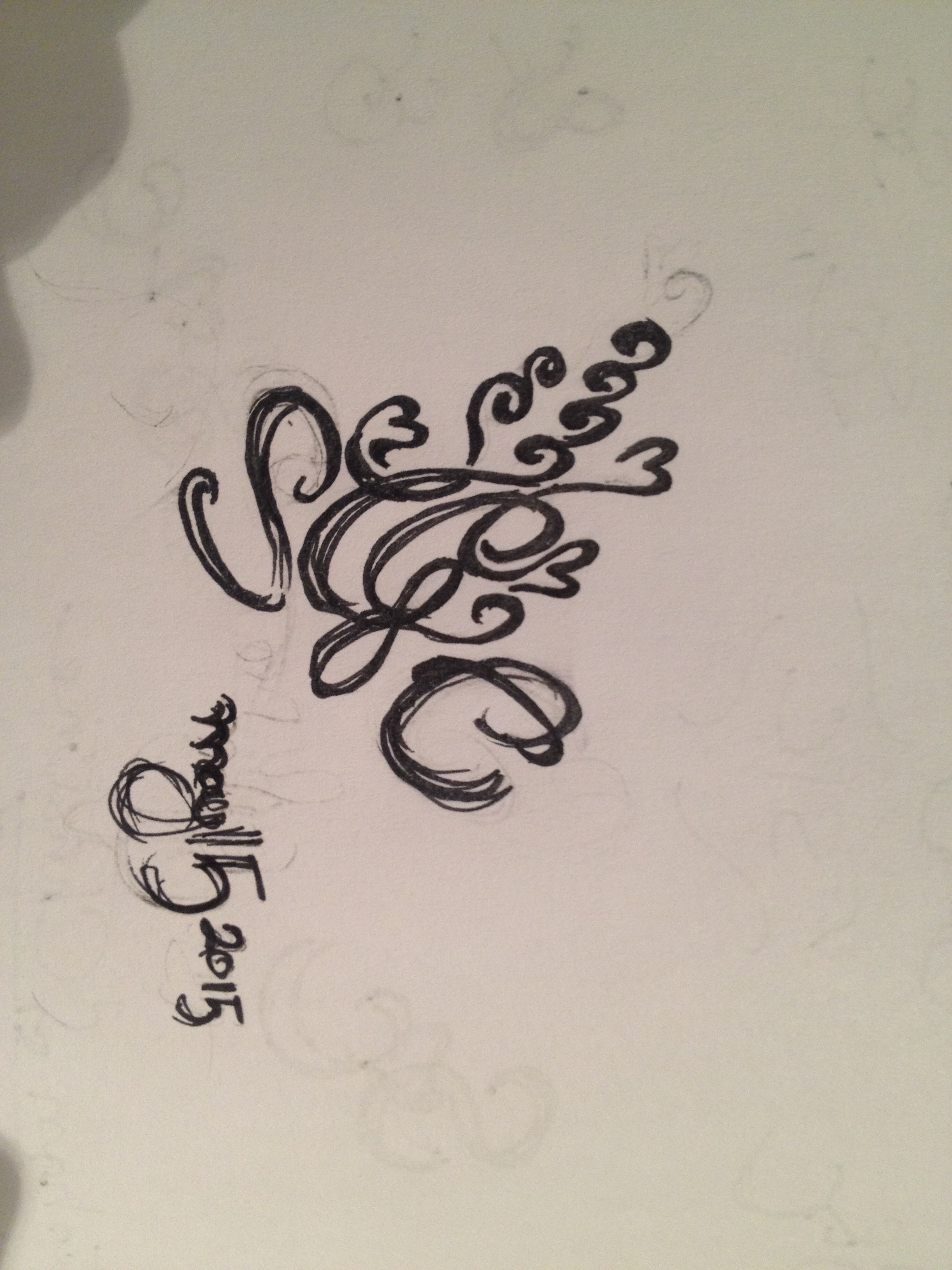
Step two consists of bringing in sketches into Adobe Illustrator, where the robots take over. Sometimes, the form stays pretty true to the sketch, other times its used as a landing pad to try different shapes and configurations. For my friends logo, I ended up with two designs. One design for larger applications i.e. to be used on a welcome or directional sign at the wedding, and the other to be used on the photo booth filmstrips and menus.
After finishing the designs, like a good mother I let my design children run free. I arrived at the wedding and was super pleased at all the places it was being used. Here are some snaps of the two logos, and link to the flat image.

Wedding two I had the honor of being part of the wedding party. Being party of the decor troops, I decided it would be nice to jazz up the usual dinner and kissing menu. Gold was the theme, and so was a dusty pink and green was the brides favorite color. I interjected some colors in the print design, pink in the form of lotus flowers and some blingy gold paper backing for a border. This was all printed on a ice gold paper stock for even more bling, Martha Stewart eat your heart out.

And finally, at the end of the busy and sometimes hair-pulling days… it was just nice to sit back, enjoy the visual works, and party like it was the summer of 2015 with some great people.


